Inspiration for your own custom home
If you’re planning to build a custom home, you’re more than likely looking to bring on an architect to plan the structure. Working with an architect can be an exciting experience, particularly when you both can connect over your vision for your dream home.
The best architects indeed consider themselves dream interpreters. They take pride in their ability to coax lifestyle desires, memories and passions from clients. They use the results to inform a very personal design. The worst architects, on the other hand, pursue their own agenda at the expense of yours. They may design a home according to a preconceived dogma without considering its livability.
Before choosing an architect, it’s important to have a good idea of what design styles you like — or don’t like — and look for architects whose work seems to fit best with your preferred styles. Most architects have websites where you can see examples of their work, and once you settle on an architect you like best, it’s always a good idea to talk with their previous clients to find out what it was like working with them.
A good architect will conduct a long client interview, sometimes even in writing. They want to know how you live in your current home and how you would prefer to live in your future one. They look for the answers to mundane questions. Where do you prefer to watch TV? Where do you tie your shoes in the morning? But they also try to unearth latent desires. What’s your favorite time of day? What most frustrates you about your current residence?
The interview process may reveal a gulf between spouses or partners. Maybe your spouse prefers contemporary architecture, though they’ve never really talked about it, while you fancy traditional design. To prevent a situation where one spouse dominates the conversation, discuss your style preferences and wish lists beforehand so you are at least somewhat on the same page. The architect shouldn’t have to become a relationship counselor.
We talked with three architects about their approach to working with homeowners to design highly personal custom homes. Each home highlights the owner’s passions and sensibilities even as they reflect the architect’s design sensibility.
Casa Cabo Pulmo

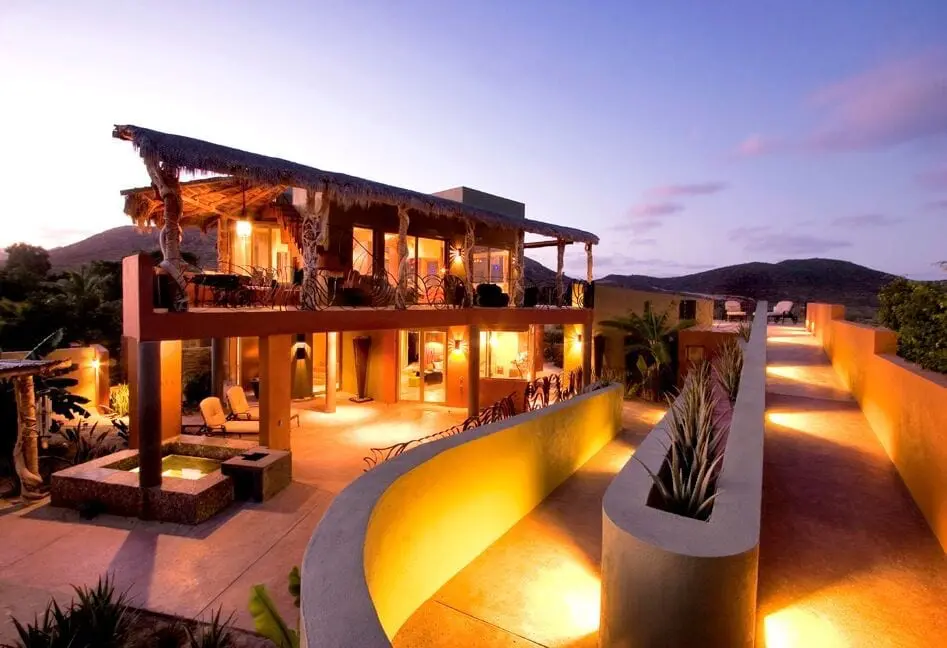
Architects Cathi and Steven House ask clients to fill out a relatively long questionnaire before they begin work. For one client, an author of the American for Disabilities Act, the questionnaire revealed that she cared dearly about one item in particular — walkways and terraces. The client had hired the Houses to design a home on the southern tip of the Baja Peninsula. “Her big concern was that many friends who would visit were disabled,” Steven remembers. “They used wheelchairs, were blind or had some kind of disability.”
To make the home accessible, the Houses designed a 165-foot entrance ramp that’s like a botanical adventure. It pauses and sweeps past agave plants with terraces for viewing. The trail ends at a covered four-sided terrace on the home’s upper floors with flush thresholds for easy wheelchair passage. The primary living area and master bedroom are on the upper floor to take advantage of the stunning views of the Sea of Cortez. On this level, cabinets and furniture, rather than walls, separate zones for living, dining, cooking and sleeping.
Guest suites, including a small kitchen, dining and living space, share the lower level. The guest bedrooms and bathrooms are equipped with overhead tracks for comfortable transfer from wheelchair to bed or bath. Designed to function off the utility grid, the home incorporates nearly every manner of passive and active solar, cross ventilation, convection heating and shading to make it comfortable without mechanical ventilation. Water is stored in the ramp. The Houses incorporated many inconspicuous universal design touches. They lowered kitchen counters so that anyone could reach them, eliminated thresholds and waterproofed the bathroom floors and walls so that the showers won’t require a curb. “When the home was complete, two friends in wheelchairs came to visit,” Steven says. “They had the time of their life, zipping around the house. They said they could live there forever.”
The Houses include some universal design in every home they design, since, as Cathi says, “we’re all growing older and will have trouble with activities. We may lower the kitchen sink even for people who aren’t yet disabled. We may make the windowsill lower so that when you are sitting it’s easy to look out the window. I rarely make a step taller than 6 inches. We prefer single-control, lever faucets. And we never use a round doorknob. It’s the most inappropriate design for getting through the doors. What happens if your child cries out in another room while you are in the shower and you have soapy hands?”
The Redaction House

Problems arise when clients approach a custom home project with preconceived notions, says architect Sebastian Schmaling. Real estate agents may convince them that they need to reach a specific bedroom count or home size to protect resale value. Or they may think they need a living room or dining room because that’s what they see in other homes on the block. What they really need is a home that suits their lifestyle, now and in the future.
“We try to get the narrative of their lives,” Schmaling says. “People may never eat at home, so they don’t need a dining room or a large kitchen. They may want an observatory more than they want a space to entertain guests. Everyone says they want a den and a guest bedroom, but they may only have guests two days a year. So why not create a den that could be converted to a guest bedroom when you need it? Things are bad when preconceptions rule.”
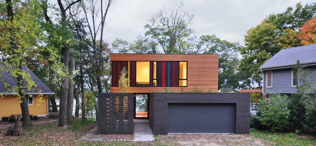
Schmaling’s interview process often results in a deeply personalized, unique home, like the one he designed in suburban Wisconsin for a fiber artist and her young family. The home was built on a lakeside parcel that had been considered unsuitable for construction. The clients wanted to make the most of the lake views, but they didn’t need to be looking at the uninspired production homes to either side of their lot.
Using computer modeling software, Schmaling assessed the views from most spots within the house. He alternated floor-to-ceiling windows with solid walls in the home’s two-story living hall to emphasize the best sightlines and filter out others. Apertures focus attention on the sky, foliage and the lake. “The home functions as an optic filter,” he says.
The sifting process starts at the street. A front path leads into a linear entry courtyard surrounded by a slotted brick wall. Perforations in the wall decrease as you draw closer to the house, beginning the process of visual redaction. At the end of a courtyard, a transparent front door, like a view finder on a camera, frames a glimpse of the lake. Visitors must reach the living hall before they get the grand view.
The starkly contemporary home resembles a wood cube. Recessed windows and doors add to the perception. Butted glass and cantilevers cut into the form, making corners disappear. Unusual red, blue, yellow and green vertical slats reference polychrome threads the fiber artist uses in her work. They contrast nicely with dark-stained horizontal cedar siding.
The house lives much larger than its 2,900 square feet. That’s due in part to the focus on exterior views but also because living zones in the open plan draw space from each other. Most rooms are grouped along the perimeter of the central gathering space. A tall fireplace wall with glass on either side visually divides the great room from a large glass-walled deck. “We actually try to reduce room count,” Schmaling says. “You can make rooms a third smaller if you borrow space from other rooms via sight lines, adjacencies and views to the outside.”
A steeply sloped, narrow lot posed a major design challenge. Schmaling’s solution was to cut into the sloping ground to create a pad for a stepped brick podium. The move produced a main floor that looks out into air, seemingly suspended in a tree canopy. The lower level, with enough room for two bedrooms and family room, walks out to a backyard that leads to the lake.
Poplar Avenue House

Architect Mark McInturff goes on a search mission when he interviews clients. He probes for hobbies, needs and passions that he can articulate in a home design. He may design a screened porch for bird-watching, a kitchen nestled inside cornerless windows for a morning person, or a backyard studio visible from the entry for an artist. “I’m always looking for the one thing about the house that makes it theirs,” he says.
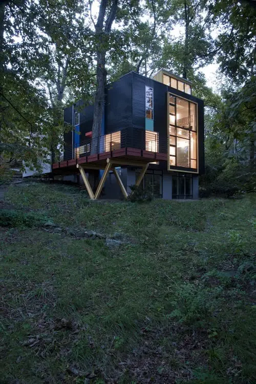
In the case of a Takoma Park, Md., home designed for a builder, the signature element is a steel staircase that cuts into an otherwise open floor plan. When he works for a builder — Alan Kanner, in this case — McInturff tries to include details that highlight the client’s construction prowess. Kanner worked with his steel contractor to produce a sculptural assembly of open steel strings and fingers supporting white oak treads. The materials continue on the second floor.
The staircase, lit by large windows, is the centerpiece of a major overhaul done to a small midcentury modern home. The architect and builder wanted to retain the design DNA of the original home but bring its layout up to date. Specifically, Kanner wanted an open plan with room to house concerts and space for his children to spread out and do homework. McInturff kept the boxy shape of the original home but added a third floor and moved the bedrooms there to take advantage of the views. Some have high clerestory windows that gather sunlight.
The move freed space on the second floor to create a wide-open plan with living, dining and kitchen spaces, and a semi-enclosed TV room. A bay window, projecting slightly from the wall, rises from the living room to the master bedroom. Picture windows and a long deck now marry living spaces to the surrounding woods. The reworked lower level includes an open family room that walks out to a sloping, wooded backyard.
The home is approached from a narrow bridge — McInturff likens it to a gangplank approaching a boat — that leads to a cantilevered deck. The deck, supported by V-shaped cradles, is another detail that highlights Kanner’s building acumen. The architect and builder could have used inexpensive wood posts to support the deck. The open cradles, built with steel pipes and I-beams, make it easier for light to reach the basement. The deck was built on temporary supports. Then crews slid the cradle into place on its footings.
The home, which McInturff terms “a magic box,” contains other post-modern details — a floating blue cabinet by the door, steel poles in the living room and a simple brick fireplace wall that anchors the living room. A raised ceiling makes the kitchen look like it was cut into a cube. The kitchen mixes black and light blue cabinetry with stainless steel appliances. The color scheme was inspired by one of artist Richard Diebenkorn’s Ocean Park paintings.
A black metal square contains a whimsical bay window with colorful panels. Other bright colors — a red canopy over the front door and a light blue accent under a window — dot the exterior. Close inspection reveals that the aluminum siding mixes horizontal and vertical laps, alternated to create texture. McInturff, who purposely used narrow laps because of the home’s small scale, compares the look to corduroy. Not everyone wants an architect-designed home. Some people prefer to pursue their own design agenda when it comes to building a custom home. But when the needs of a homeowner and the aesthetic of an architect mesh, the result can be stunning — a unique achievement that can even reach into the realm of art.

Boyce Thompson is the author of three books on residential design and construction. His first book, The New New Home, published by The Taunton Press, was named book of the year by the National Association of Real Estate Editors. Anatomy of a Great Home (Schiffer Publishing 2018) features the work of three dozen of the country’s leading architects. The book identifies the common elements of great residential architecture, breaking them down into terms anyone can appreciate. Designing for Disaster, to be published by Schiffer in 2019, identifies best practices for resilient home design.
In 2008, Thompson was given the Crain Award by American Business Media for lifetime achievement in business media. In 2010, he was inducted into the Editorial Hall of Fame by min magazine, a magazine for publication professionals. Thompson holds a BA in English from Northwestern University and a master’s degree in journalism from the University of Missouri. He lives in Bethesda, Maryland.
 5 Hot Custom Home Design Trends in 2019