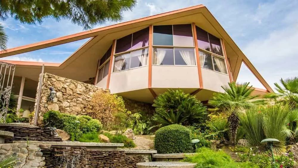
Mid-century modern design is the epitome of retro-cool, but it can be tricky to pull off with panache. A home designed in this style can easily go from sexy and sophisticated (think Mad Men) to kitschy and homey (hello, Brady Bunch) without the proper amount of restraint, so it’s best to go slow and build your look in stages.
Rooted in the German Bauhaus movement as well as Danish modernism, mid-century modern’s post-World War II is practicality a direct rebuke of the decadent, gilded flair of the 1940s. It’s classy without the flashy, a style known for filtering out anything too extraneous, such as a pile of fluffy pillows or intricate woodworking.
Even though it’s a visually distinct style, many think of mid-century modern design as classic and timeless — in part because it pairs so nicely with many of the American architectural styles constructed during the post-war boom. As a result of its popularity, authentic pieces can be pricey, but it’s relatively easy to find adapted pieces that echo the look of the real thing for a lot less.
If you’re a fan of mid-century modern design, raise your martini glass to the following guidelines, designed to help you create the look of mid-century modern design.
Functional Furnishings
Furniture made of natural woods, especially oak and tweak, is key to decorating in the mid-century modern design style. Look for pieces that are structured and streamlined with straight lines, gentle curves, and minimal adornment — save for a brass knob or handle here and there. Seating should be both lounge-like and sturdy, with smooth, thin arms that are frequently left bare and unupholstered. Hairpin legs are also common in mid-century modern design. For a statement piece symbolic of the era, there’s nothing like the Saarinen tulip table and Eames’ iconic lounge chair and molded plastic shell chairs. While getting your hands on the real things can be pricey, knockoffs are relatively easy to find from brands such as Restoration Hardware.
Bold Color Choices
A vast array of colors are associated with mid-century modern design — it’s a style that’s definitely not afraid to take risks with colors you don’t necessarily see often. Try mixing deep earth tones such as dark teal, rust, and mossy green with a bevy of beige and brown for neutrals, and a few bright spots of poppy red and mustard yellow. When it comes to your walls, mid-century modern design calls for leaving them white. This way they’re treated more like a blank canvas for the bevy of graphic wall art, mirrors, and other decor pieces that accent most rooms.
Natural Surfaces Everywhere
Exposed ceiling beams, concrete floors or countertops, and wood panels are all at home in mid-century modern design. If you’re not building new — or remodeling completely — look for wall accents and decorative objects made of these natural materials to exude the essence of the style without breaking the bank.
Accessorize Away
Sunburst mirrors and abstract, retro art that feels more folksy than fancy, graphic wall hangings, and vintage-inspired pieces are some of the most popular ways to accessorize a home done in the mid-century modern design style. Look for bubble-shaped ceramic vases in myriad colors, as well as planters with wooden legs. Keep in mind that cocktail culture was practically born at the same time that mid-century modern design rose to popularity, so go ahead and make a funky bar cart the ultimate statement piece.
Pattern Play
Graphic, geometric prints make great textile statements in mid-century modern design, but restraint is key. While they’re not necessarily meant to be used as accents only, mid-century modern prints can quickly overwhelm a room. If you opt for curtains with geo circles, for example, pair them with a sofa and chairs in a single, neutral hue.
Mix and Match Textures
Despite their different textures, a velvet couch, a shag rug, and a glass top table blend seamlessly in mid-century design. Even natural elements, such as wicker or rattan, can be folded into the mix for an organic touch and even more dimension. Together they create visual interest by avoiding the look of matching furniture.
Light Bright
When it comes to illuminating a room designed in the mid-century modern style, look for tabletop lamps and ceiling lights made of glass or ceramics. Pendants in particular work beautifully, especially those in a round shape. Try not to pair up your lighting; mid-century modern design looks best when a room seems pulled together, not overly matchy-matchy.
Despite all the ways to play with mid-century modern design, it’s important that your rooms maintain an airy feel to them to stay true to the style. This is relatively easy to do, given that most furnishings in this style have thin legs and simple silhouettes. Just make sure not to overdo it with too many accessories.

Ana Connery is former content director of Parenting, Babytalk, Pregnancy Planner and Conceive magazines as well as parenting.com.
While editor in chief of Florida Travel & Life magazine from 2006-2009, she covered the state’s real estate and home design market as well as travel destinations.
She’s held senior editorial positions at some of the country’s most celebrated magazines, including Latina, Fitness and Cooking Light, where she oversaw the brand’s “FitHouse” show home.
Ana’s expertise is frequently sought after for appearances on “The Today Show,” “Good Morning America” and CNN. She has interviewed the country’s top experts in a variety of fields, including U.S. Secretary of Education Arne Duncan and First Lady Michelle Obama.
 Top 10 Safest Cities in Delaware