For any new homeowner, the choice of paint colors can be easily complicated by too many options. It often feels like more than a simple color selection because the walls can set a mood for the entire room. A soft, warm white may create a touch of elegance wrapped in familiar comfort. A poppy red brings a level of vibrant energy, connecting the modern aesthetic with a youthful resilience. It’s up to you as the homeowner to decide what is right for you and which colors will suit your needs best.
If you’re having trouble narrowing down your options, it’s a good idea to discuss your ideas with a professional interior designer. They can help you put together a home that fits your personality, often by combining colors and elements that you might not think to put together at first.
Whether you opt for a gentle beige or a calming blue-green, a bright crimson or a stately vintage navy with gold accents, or even a bold palette of gorgeous color combinations, the possibilities are endless.
Seeking Balance Between Comfort and Self-Expression
Every year, interior design labs at your favorite paint retailers send color experts to travel across the world, analyzing trends in fashion and design, taking notes on the current trends, and consulting consumer insight reports to declare a winner of their respctive, highly sought after Color of the Year award winners. Through the process, psychologists, marketers, designers, fashion gurus, and homebuyers just like you are consulted for their expertise on the subject and after many long months, each brand has named their choice.
Cracked Pepper by Behr
Behr’s pick for color of the year is the stunning Cracked Pepper, an attractive neutral that breaks the boundaries between comfort and elegance. Its warm appearance creates an instantly comfy zone, and allows a soft flow of energy to move through the room. Pairing perfectly well with several accent colors, the hue extends a warm welcome to all guests. Use it in a bedroom to create the perfect balance between moody drama and peaceful rest, or apply it to a bathroom or kitchen for a dramatic aesthetic.
Blue Nova 825 by Benjamin Moore
This electric pop of vibrant blue sparks optimism and whimsy. Blue Nova 825 offers an invigorating combination of ocean and sky, an expert combination of broadened horizons and reassurance. Blue Nova 825 brings the moods of nature into the home, simultaneously energizing and grounding your space. Find your inner light by embracing a vibrant and moody color palette.
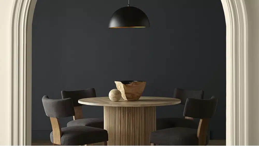
Ironside by Dutch Boy Paints
Ironside is a balanced neutral with a calming sense of harmonic restoration and peaceful contentment. It pairs so beautifully with trendy palettes shared by Dutch Boy Paints, as well as many other modern combinations. Its cool undertones are reminiscent of a botanical garden while its earthy layers offer a versatile and grounded neutral.
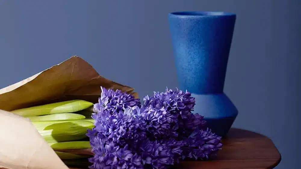
Skipping Stones by Dunn-Edwards
Dunn-Edwards has brought a cool blue reminiscent of lazy days spent at the lake. Skipping Stones is a sparkly blue is intimate and cozy, but also bold and self-assured. Pair it with a creamy neutral accent or botanical earth tones.
Upward by Sherwin Williams
A sunny day shadow, Sherwin Williams’ Upward is reminiscent of watching the shapes the clouds make on a windy day in spring. Fill your home with the subtle delight of this remarkable neutral that can open up your space while centering balance and a skyward push.
Sweet Embrace by Dulux
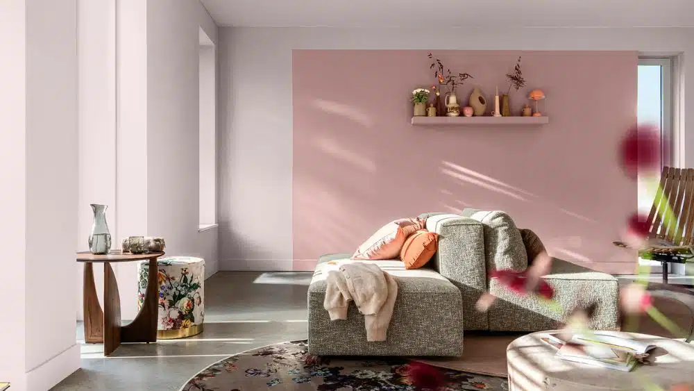
For a special softness and uplifting tone, Sweet Embrace by Dulux is a perfect choice for any kitchen, breakfast nook, or sunroom. Its mellow and romantic hue will warm your living room and reflect any natural light that finds its way in. Quietly transitioning from playful and inviting, to cozy and cocooning, this shade is sure to please all ages.
Viridis by Graham & Brown
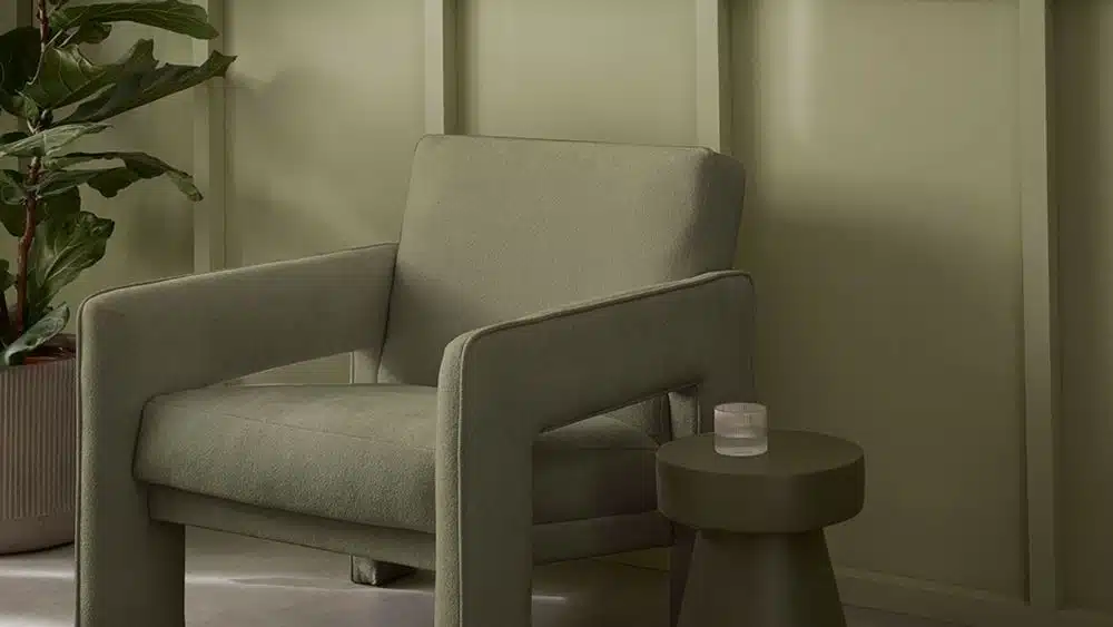
A charming and vibrant chartreuse, Viridis by Graham & Brown invokes a history of grandeur and elegance. The the bright greens, tempered by creamy highlights make a stunning entrance to any home. Whether you are looking for a feeling of tranquil serenity in your bedroom sanctuary or an inviting and charismatic color for entertaining in the living room, this hue is sure to dazzle your expectations.
Limitless by Glidden Paints
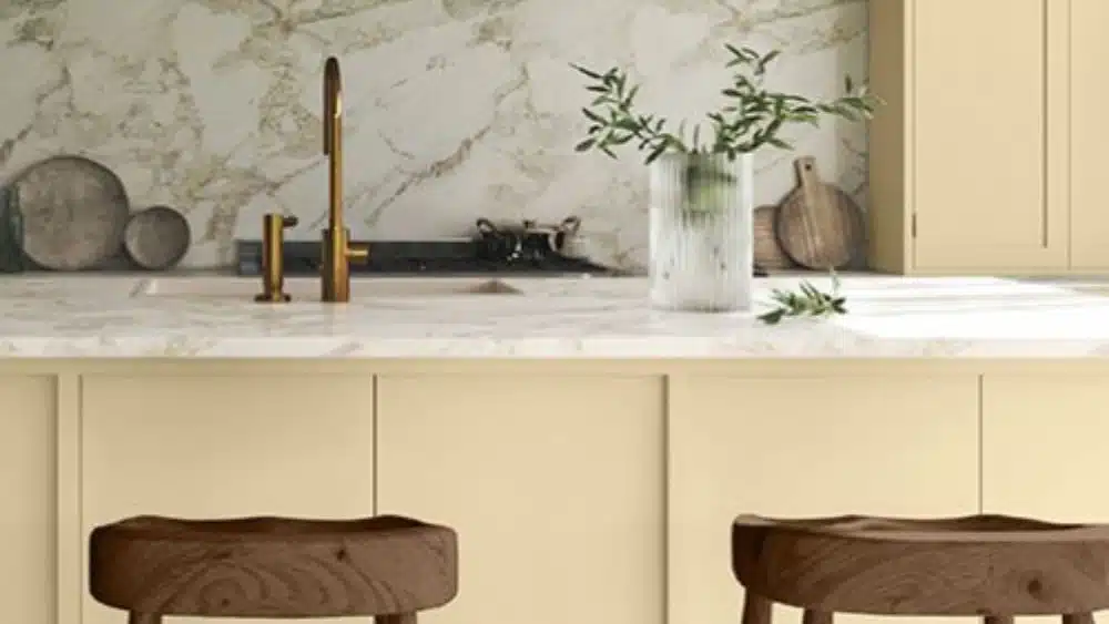
Trendy teals have been hot on the market for a minute, but Limitless is making a new kind of splash. This unique setting in between a creamy taupe and cool buttery yellow makes for an elegant and serene addition to any home. Its floral roots pair well with creamy neutrals, wood grains, and a cozy evening in.
Peach Fuzz by Pantone

Peach Fuzz, a gentle, yet fruity color, invokes a sense of optimism that, depending on how you style it, can be both calming and energizing. Pantone took inspiration from both technology and nature for this color; use it on an accent wall in your office to remind you to slow down and breathe during a busy day, or make it a festive addition to family dinners in the kitchen. No matter what, you can’t go wrong.
Renew Blue by Valspar
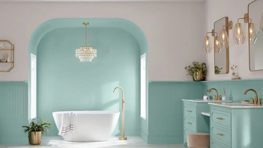
Renew Blue is a charming turquoise that transports you to a sunlit beach, not middle school. This calming coastal vibe creates an atmosphere of serenity and effortless cool. Make Renew Blue pop by pairing it with sandy neutrals and creamy whites.
Palettes
Several paint brands choose a certain palette or group of colors to earn the title. Based on the same criteria as Color of the Year, these notable palettes are likely to take over as the boldest new trends in home design.
Choose Your Style
Now that you know the predicted top color selections for 2023, you can mix and match and find your style. Don’t be afraid to test out a few. Paint one wall or a section and decide how it makes you feel. If you don’t love it, just paint it over and start anew. This year, the colors are bold, resilient, and perfect for a bright new refresh.

After graduating in 2016 from The University of Texas with a degree in English, Sanda Brown became a content writer for the BDX with a focus on website copy and content marketing.
At the BDX, Sanda helps write and edit articles on NewHomeSource.com, writes website copy for builders, and manages a team of freelancers that work on additional content needs.
 Top 10 Safest Cities in Utah